
How to Read a Candlestick Chart: The Basics
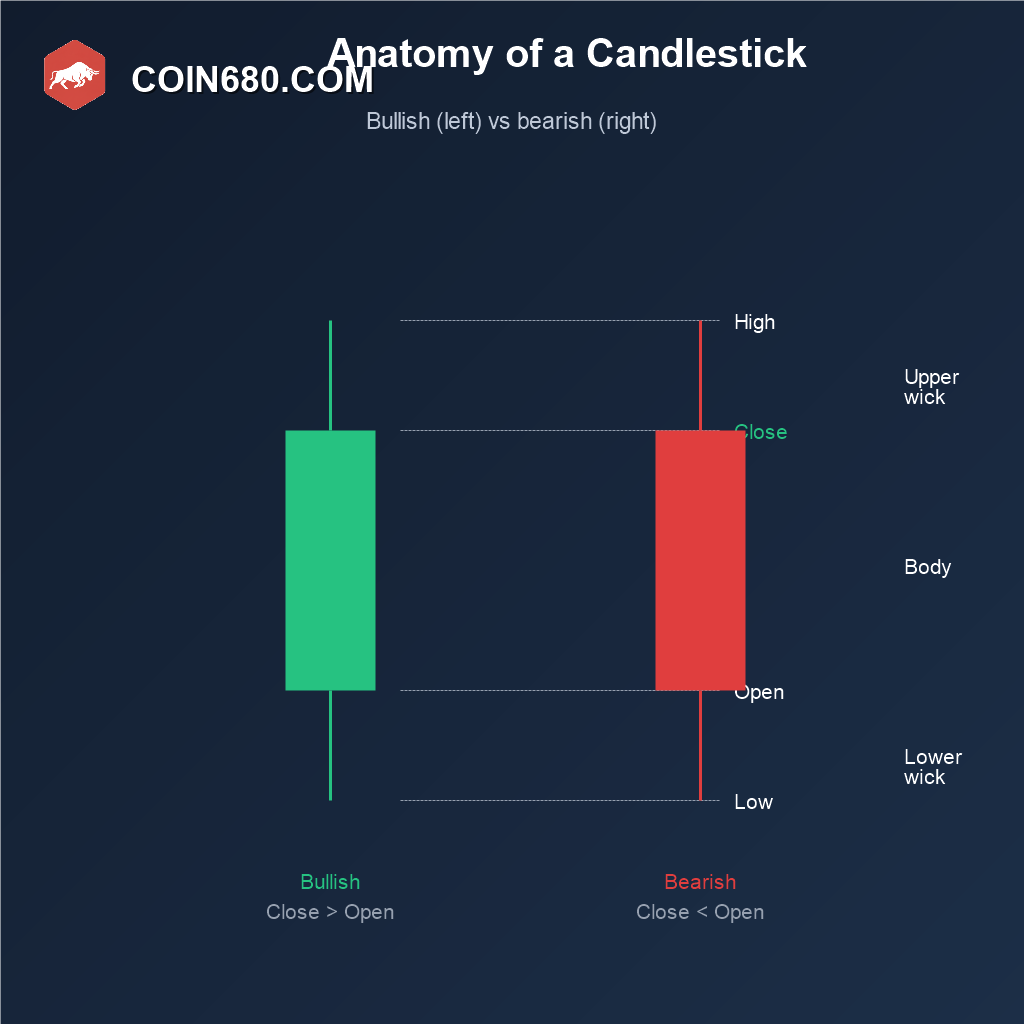
Every price chart you will ever look at on an exchange is really just a wall of these small shapes stacked next to each other. Learn to read one candlestick correctly and the whole chart stops looking like noise and starts looking like a record of an actual fight between buyers and sellers.
What a Single Candlestick Actually Shows
A candlestick summarizes four numbers for one time period: the open price, the close price, the high price, and the low price. The thick rectangle in the middle is called the body, and it runs from the open to the close. The thin lines sticking out above and below are called wicks, or shadows, and they mark the highest and lowest prices that were touched during that period even if price did not stay there.
If the close ends up higher than the open, the body is usually colored green or white, and the candle is called bullish. If the close ends up lower than the open, the body is usually colored red or black, and the candle is called bearish. Nothing more mysterious than that is going on inside a single candle.
What the Wicks Are Telling You
The body tells you where price landed. The wicks tell you where price tried to go and got rejected. A candle with a long upper wick and a small body means buyers pushed price up during the period, but sellers stepped in hard enough to drag it back down before the close, a sign of resistance at that level. A candle with a long lower wick means the opposite: sellers pushed price down, but buyers stepped in and dragged it back up, a sign of support.
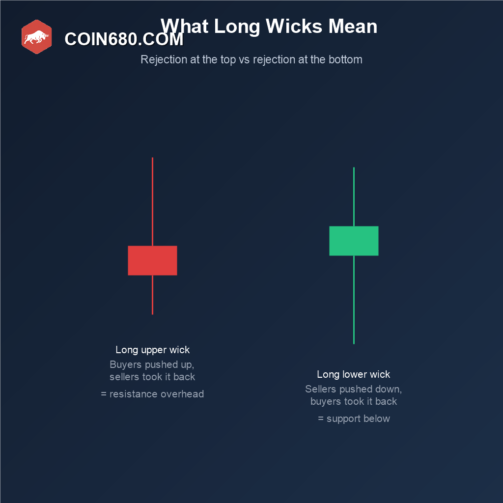
A candle with almost no wick at all, where the body takes up nearly the entire range, shows one side was in firm control for that entire period with barely any pushback. These single-candle reads are useful, but they mean more when you look at several candles together rather than judging one in isolation.
Reading a Sequence, Not Just One Candle
A single green candle after ten red ones is not automatically a reversal, and a single red candle inside a strong uptrend is not automatically the top. What matters is the story a run of candles tells: a series of candles with small bodies and shrinking ranges usually means the market is losing energy and pausing, while a series of candles with large bodies in the same direction usually means a real trend with conviction behind it.
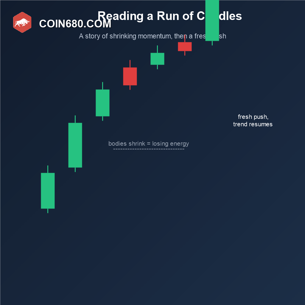
This is also the foundation for every named pattern covered elsewhere in this Academy, from single-candle patterns like the doji and hammer to the multi-candle chart patterns like head and shoulders or double tops. All of them are built entirely from the open, close, high, and low logic covered above, just arranged into a recognizable shape.
Picking a Timeframe
Every candle represents a fixed period of time you choose yourself: one minute, one hour, four hours, one day, one week. The same exact price action looks completely different depending on which timeframe you are viewing it on, so the choice matters more than beginners tend to assume.
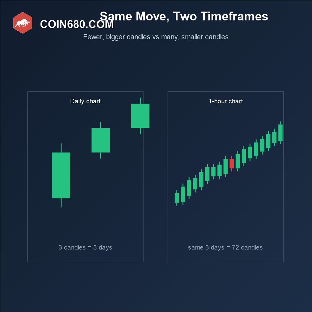
Day traders tend to work on 5-minute or 15-minute charts where a full session shows dozens of candles. Swing traders more often use 4-hour or daily charts to filter out the noise of small intraday swings. Longer-term investors typically stick to daily or weekly candles, where each shape represents a much bigger, more meaningful move. There is no single correct timeframe, only the one that matches how long you actually intend to hold a position.
Common Mistakes When Starting Out
The most common mistake is reading a single candle as a signal on its own, without checking the broader trend or the timeframe it sits on. A second is ignoring volume entirely, since a candle formed on unusually high volume carries more weight than the same shape formed on a quiet, low-volume period. A third is switching timeframes constantly looking for a pattern that confirms a bias already decided in advance, rather than reading whichever timeframe was chosen at the start.
Frequently Asked Questions
Do candlesticks only work for Bitcoin and crypto?
No, the same open-high-low-close logic is used across stocks, forex, commodities, and every other market with a price history. Crypto exchanges simply display it by default because it packs more information into less space than a plain line chart.
Why are some candlesticks green and red, and others black and white?
Color is just a display choice made by the exchange or charting platform. Green or white always means the close was higher than the open, and red or black always means the close was lower, regardless of which exact colors an app uses.
What is the difference between a candlestick chart and a line chart?
A line chart only plots the closing price for each period, connected into a single line, so it hides the open, high, and low entirely. A candlestick shows all four numbers per period, which is why most active traders prefer it.
How many candles should I look at before making a decision?
There is no fixed number, but relying on a single candle in isolation is generally considered weak analysis. Most traders look at a broader run of candles alongside support, resistance, and volume before treating any shape as meaningful.
Educational content only, not financial advice. Chart reading describes historical price behavior and does not guarantee what price will do next. Always research thoroughly before trading or investing.
Once the anatomy of a single candle makes sense, the next step is recognizing the shapes several candles form together, starting with the head and shoulders pattern, the triangle patterns, and the double top and double bottom pattern, or browse the full Bitcoin Academy for everything else covered so far.